Pinks Pizza Website Redesign
2017 at Oak Interactive
Overview
To meet the needs of a growing digital first, “Can I order from my phone” customer base, Pinks Pizza needed a solution for easy online ordering through their website.
Disciplines
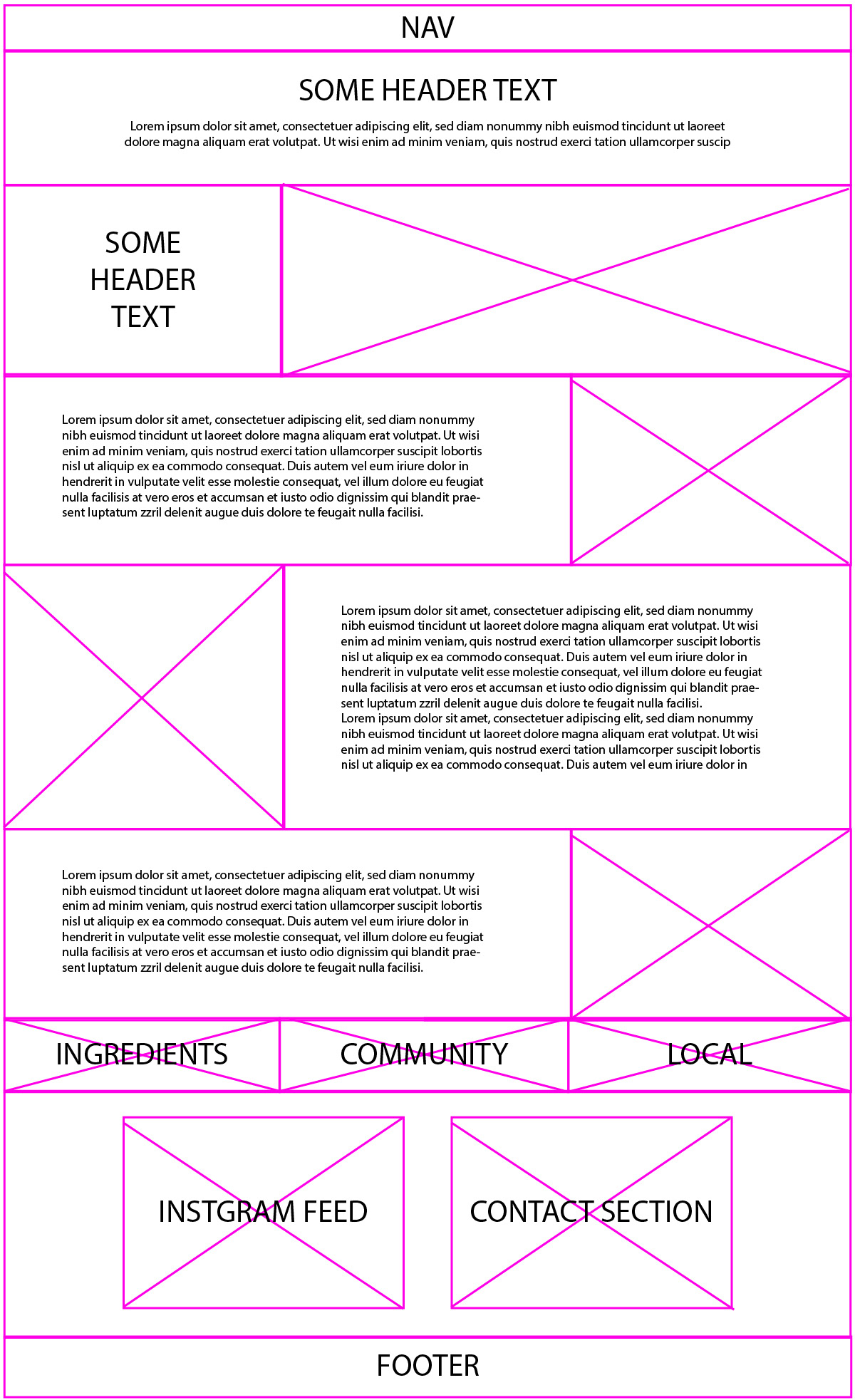
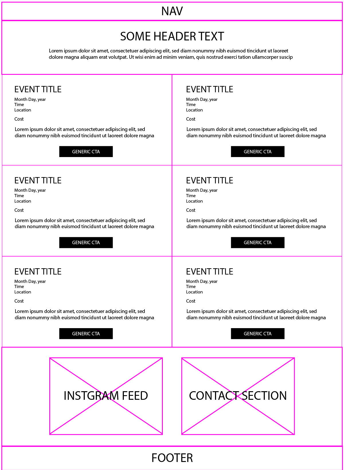
Web Design
Web Development
Content Strategy
Email
Curiosity
They loved their original website, but it was an older flash site that could not be updated due to technological changes. To take orders online they started using Revel’s POS and enjoyed how streamlined it made the process for each location so that would need to stay the same.
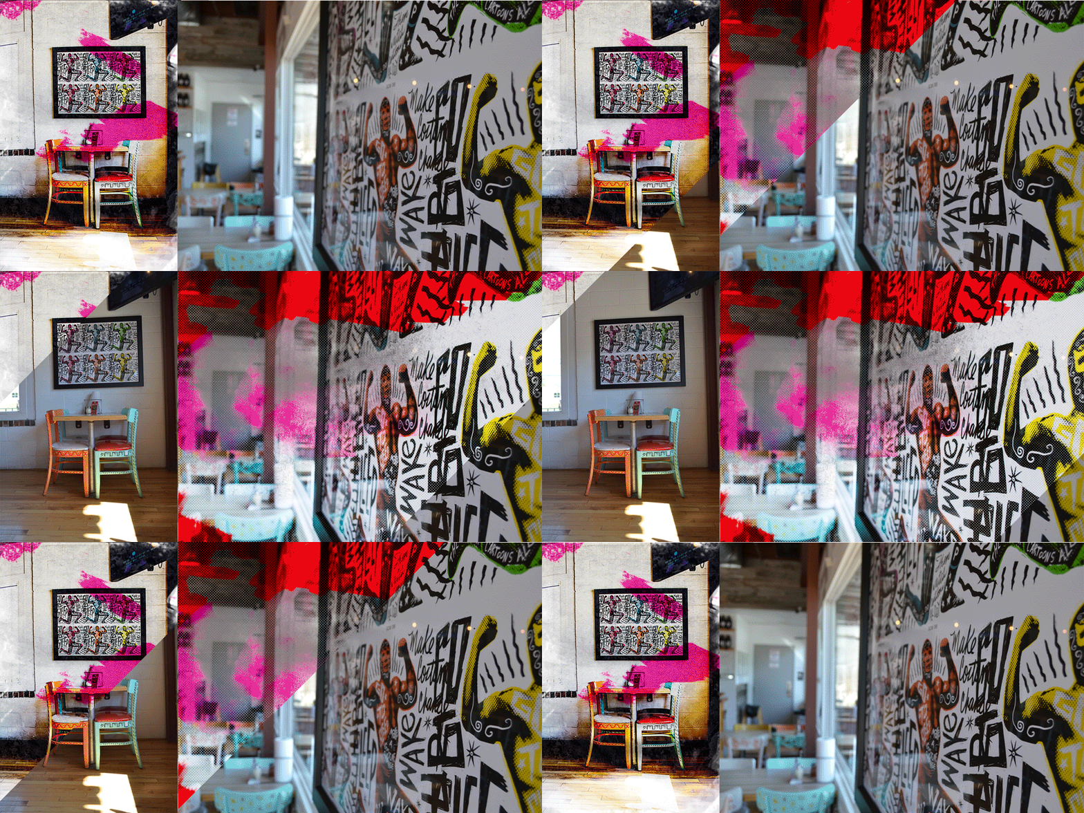
In homage to their original clientele, local skater kids, Pinks’ owner wanted the site to “feel rebellious".
Conflict
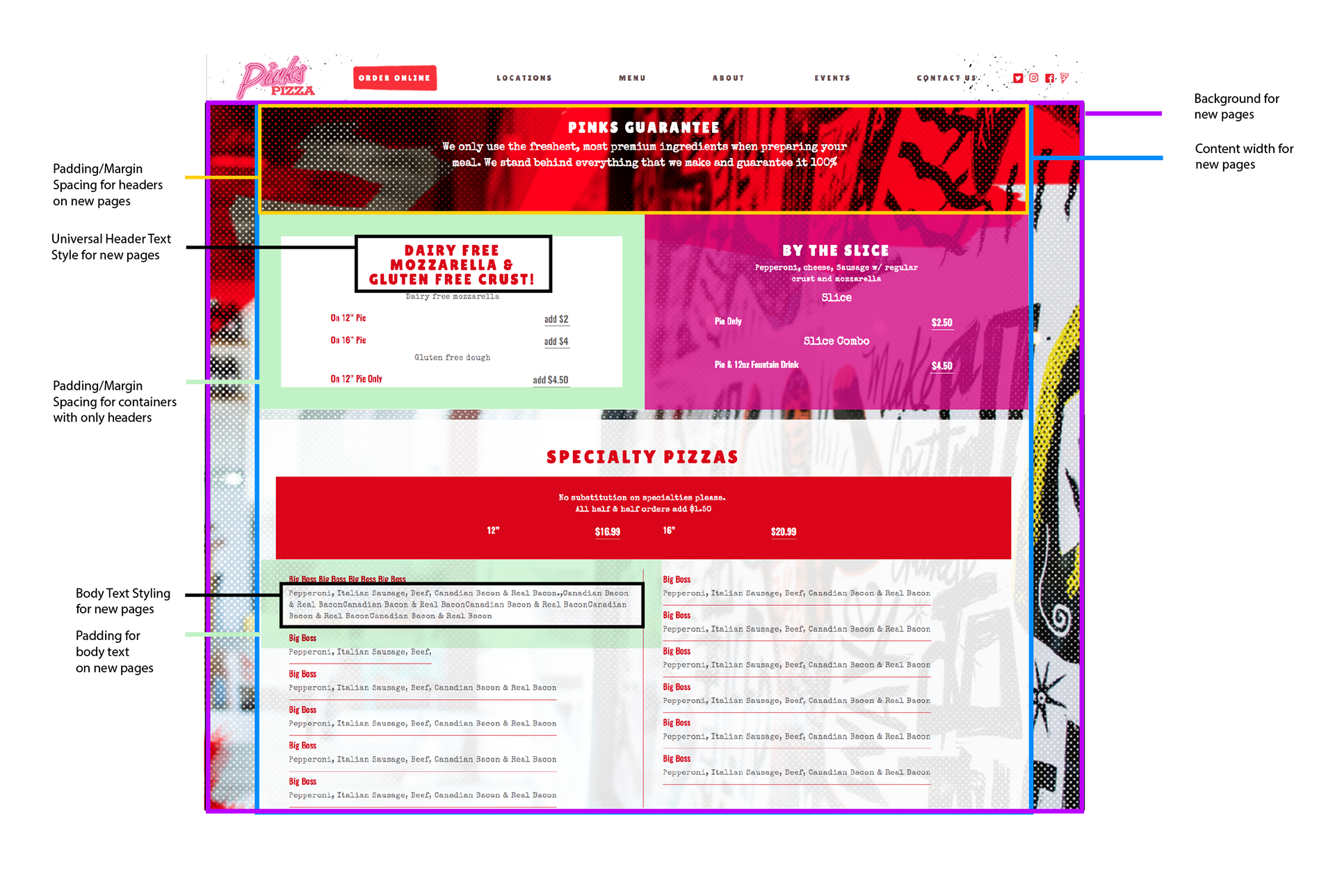
How can “rebellion” be communicated visually? Because they want to stick with their online ordering, how do we link them over from the main site stylishly?
HTML Bootstrap Landing Page
